Multiple Choice
The figure below shows the demand and supply curves for pollution abatement.
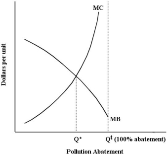 FIGURE 17-3
-Refer to Figure 17-3.On the horizontal axis,the label ʺQt(100% abatement) ʺ refers to
Definitions:
Related Questions
Q14: When calculating GDP from the expenditure side,
Q17: Refer to Figure 17-3. What area on
Q18: Refer to Table 13-3. The increase in
Q21: Consider the simplest macro model with demand-determined
Q50: The concept of moral hazard was publicly
Q53: Attempts by professional lobbyists in Ottawa to
Q101: Refer to Figure 13-2. This factor market
Q111: The average union wage premium in Canada
Q128: Consider a simple macro model with a
Q152: Other things being equal, higher real interest