The following graph shows average fixed costs, average variable costs, average total costs, and marginal costs of production. 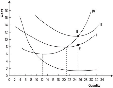 Why does the distance between curves II and III get smaller as quantity increases?
Definitions:
Modified Version
A version that has been altered or adjusted from its original form.
Socialist Economy
An economic system where the means of production, distribution, and exchange are owned or regulated by the community as a whole.
Market Failure
A situation in which the allocation of goods and services by a free market is not efficient, often leading to a net social welfare loss.
Allocated Efficiently
Refers to the optimal distribution of resources and goods in a way that maximizes the welfare or utility of consumers.
Q4: If a machine cost $50,000 initially and
Q6: Which of the following statements is true?<br>A)
Q57: If the demand for Insulin is highly
Q59: The long-run average cost curve is tangent
Q81: Which of the following provides the best
Q89: The distance between the demand curve and
Q97: Refer to the graph shown of average
Q101: The reason for the merger of two
Q113: If marginal cost is less than average
Q134: Refer to the following graph. <img src="https://d2lvgg3v3hfg70.cloudfront.net/TB7145/.jpg"