The following figure shows a graph that compares the present values of two ordinary annuities of $800 quarterly as functions of the number of quarters. One annuity is at an annual rate of 6% compounded quarterly, and the other is at an annual rate of 9% compounded quarterly. Use the graph below to estimate the difference between the present values of these annuities for 25 years (100 quarters) . 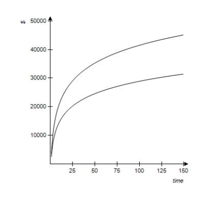
Definitions:
Federal Poverty Level
a measure issued annually by the Department of Health and Human Services used to determine eligibility for various federal programs and benefits.
Incomes
The money received by an individual or organization, typically on a regular basis, for work, through investments, or from benefits.
Cultural Backgrounds
The cultural experiences, practices, languages, values, and worldviews that shape an individual's identity and perceptions, influenced by the society and community they are raised in.
Poverty
Poverty is a state or condition in which a person or community lacks the financial resources and essentials for a minimum standard of living.
Q1: The simplex matrix shown below indicates that
Q15: Which frequency histogram best describes the data
Q36: A department store manager wants to display
Q38: Write the dual maximization problem. Be sure
Q59: Use the simplex method to maximize the
Q71: In a laboratory experiment, two separate foods
Q84: A recent college graduate begins a savings
Q88: For the function in this problem, find
Q93: If A is a <img src="https://d2lvgg3v3hfg70.cloudfront.net/TB1243/.jpg" alt="If
Q157: Can the matrix <img src="https://d2lvgg3v3hfg70.cloudfront.net/TB1243/.jpg" alt="Can the