The diagram below shows the demand and supply curves in a perfectly competitive market. 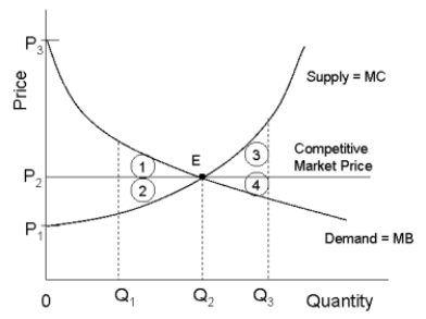 FIGURE 12-5
-Refer to Figure 12-5. If output in this market were Q₃, the loss in total economic surplus relative to the competitive equilibrium would be illustrated by area
Definitions:
Cap-And-Trade
Cap-and-trade is an environmental policy tool designed to reduce pollution by setting a limit (cap) on emissions and allowing businesses to buy, sell, or trade permits for emissions under this cap.
Emission Allowances
Emission allowances are permits or credits that allow the holder to emit a certain amount of pollutants over a set period.
Aggregate Emissions
The total amount of emissions (such as CO2, methane) released into the atmosphere by a specific entity, region, or activity, contributing to environmental impacts like climate change.
Sustainability Initiatives
Practices and strategies companies implement to manage and improve the environmental, social, and economic impacts of their operations.
Q4: If a single-price monopolist sets price where
Q5: Refer to Figure 12-4. Suppose a disequilibrium
Q10: Allocative efficiency concerns<br>A) the allocation of resources
Q14: In a modern mixed economy the government
Q36: Partial-equilibrium analysis considers<br>A) all markets simultaneously, recognizing
Q37: In competitive markets, price floors and price
Q58: demand curve to shift to the left.<br>A)
Q62: Suppose a production function for a firm
Q78: A book manufacturing company sells equipment for
Q87: A modern economy like Canada's is largely