Figure 35-4.The left-hand graph shows a short-run aggregate-supply (SRAS) curve and two aggregate-demand (AD) curves.On the left-hand diagram,the price level is measured on the vertical axis;on the right-hand diagram,the inflation rate is measured on the vertical axis. 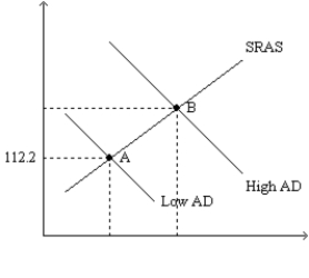
-Refer to Figure 35-4.Assume the figure charts possible outcomes for the year 2018.In 2018,the economy is at point B on the left-hand graph,which corresponds to point B on the right-hand graph.Also,point A on the left-hand graph corresponds to A on the right-hand graph.The price level in the year 2018 is
Definitions:
Q4: Refer to Scenario 34-1. For this economy,
Q66: If the central bank increases the money
Q93: Refer to Figure 34-1. Which of the
Q195: People might withdraw money from interest-bearing accounts,<br>A)making
Q218: Which of the following is vertical?<br>A)both the
Q283: Supply-side economists believe that changes in government
Q415: A favorable supply shock shifts the short-run
Q436: If consumer confidence rises and inflation expectations
Q478: Which of the following is an example
Q502: Suppose that the government increases expenditures by