Use the graph to answer the question.
-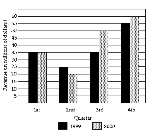
In what quarter was the revenue the least for 2000?
Definitions:
Pie Graph
A visual representation of data that divides a circle into slices to illustrate numerical proportions.
Frequency Distribution
A table or graph that displays how often different values or categories occur in a dataset.
Histogram
A histogram is a graphical representation that organizes a group of data points into user-specified ranges, showing the frequency of data values within those ranges.
Frequency Polygon
A graphical representation of a frequency distribution where values are plotted on the x-axis and frequencies on the y-axis, connected by straight lines.
Q3: The demand for basketball tickets is a
Q10: The test scores of 15 students
Q11: The table contains the weights (in
Q12: A medical research team studied the
Q18: The following data show the body
Q29: The value of your house is rising
Q50: The mean score on the exit examination
Q63: <span class="ql-formula" data-value="\mathrm { E } =
Q89: Convert 2.5 to a reduced fraction.<br>A)25<br>B)5<br>C)
Q131: Discuss why it is not possible to