Multiple Choice
The scatter diagram shows the relationship between average number of years of education and births per woman ofchild bearing age in selected countries. Use the scatter plot to determine whether the statement is true or false.
-There is a causal relationship between years of education and births per woman. 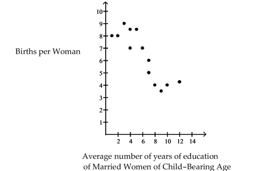
Definitions:
Related Questions
Q13: In a carnival game, a person wagers
Q23: The data below are the final
Q24: The cholesterol levels (in milligrams per
Q64: A seed company has a test
Q90: 149, 106, 114, 293, 106, 162, 224,
Q93: For the following conditions, determine if
Q104: Residual analysis cannot be used to check
Q114: The failure rate in a German class
Q176: CampusFest is a student festival where local
Q181: <span class="ql-formula" data-value="\log _ { 5 }