Multiple Choice
The graph given below compares the GDP of a country with the country's energy consumption. Analyze the graph and identify a statement that is true for the years 1960-2000. 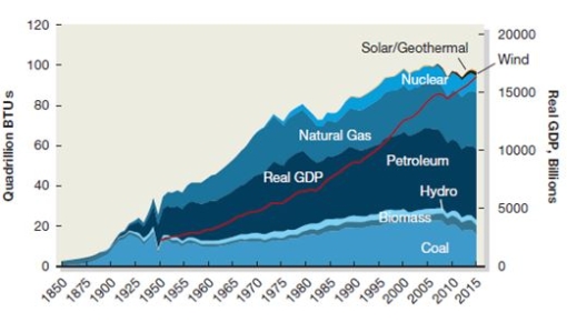
Definitions:
Related Questions
Q3: In the context of choosing an international
Q12: In the context of companies entering foreign
Q20: Which of the following is one of
Q20: Frido Innovative Techno has several regional research
Q25: Bank of Linsdon lends $1,000,000 to SBC
Q40: The government of Meditania, a country in
Q47: In contrast to anarchists, individualists believe that:<br>A)
Q47: Evaluate the importance of flexibility when developing
Q53: In the context of entering a foreign
Q61: Nebula Inc. is an American smartphone manufacturer