Solve the problem.
-The following graph shows the private, public and total national school enrollment for students for select years from 1970 through 2000. 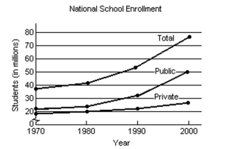 i) How is the graph for total school enrollment, T, determined from the graph of the private enrollment, r, and the
Public enrollment, u?
Ii) During which 10-year period did the total number of students enrolled increase the least?
Iii) During which 10-year period did the total number of students enrolled increase the most?
Definitions:
Q20: <img src="https://d2lvgg3v3hfg70.cloudfront.net/TB8475/.jpg" alt=" A)
Q47: A school is sending 9 children to
Q52: The following bar graph shows the average
Q60: <img src="https://d2lvgg3v3hfg70.cloudfront.net/TB8475/.jpg" alt=" A) (x -
Q81: Given the following data set, the IQR
Q85: <img src="https://d2lvgg3v3hfg70.cloudfront.net/TB8475/.jpg" alt=" A) Yes B)
Q97: Find <img src="https://d2lvgg3v3hfg70.cloudfront.net/TB8376/.jpg" alt="Find ,
Q115: x varies inversely as <img src="https://d2lvgg3v3hfg70.cloudfront.net/TB8475/.jpg" alt="x
Q130: The Family Fine Arts Center charges $23
Q170: <img src="https://d2lvgg3v3hfg70.cloudfront.net/TB8475/.jpg" alt=" A)