Multiple Choice
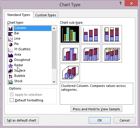 In the figure above, which chart would you most likely use to show comparisons of values, such as annual sales for a different product for several sales representatives?
Definitions:
Related Questions
Q2: In what ways can private investors affect
Q4: The chart type that shows trends over
Q5: _ is best for managing quantitative data.<br>A)
Q15: <img src="https://d2lvgg3v3hfg70.cloudfront.net/TBX8825/.jpg" alt=" In the accompanying
Q27: HTML 4 is the latest version of
Q34: This property makes sure that controls in
Q36: In Word, Excel, and PowerPoint, the interface
Q37: Tables with a many-to-many relationship must be
Q47: The combo box gets its values from
Q56: When a query is based on another