(Figure: Peak-Load Pricing Model) The graph represents the market for a good that follows a peak-load pricing model. Which curve represents marginal cost?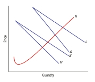
Definitions:
Market Risk Premium
The surplus earnings expected by investors for possessing a market portfolio with risks as opposed to secure, riskless assets.
CAPM
Capital Asset Pricing Model, a formula that describes the relationship between the expected return of an investment and its risk.
Marginal Cost
The cost incurred by producing one additional unit of a product or service, critical for pricing and production decisions.
Retained Earnings
Retained earnings represent the cumulative amount of net income that a company has reinvested in its business rather than distributed to shareholders as dividends.
Q13: Studies suggest that it is common for
Q25: Traditional causes of poverty include<br>A) an unwillingness
Q81: The short-run supply curve for a network
Q109: One of the major difficulties in determining
Q217: The official U.S. poverty threshold is roughly<br>A)
Q224: Food stamps were originally included in the
Q248: The question of whether a particular income
Q276: Versioning is a type of intertemporal pricing.
Q286: Households with a ratio of household income
Q334: (Figure: Market for a Network Good 2)