Figure 3.5 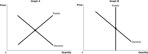 Alt text for Figure 3.5a: In figure 3.5a, a graph of intersecting supply and demand curves representing the markets for original Picasso paintings and designer jeans.
Long description for Figure 3.5a: The x-axis is labelled, Quantity, and the y-axis is labelled, Price.Curve Supply is a straight line which slopes up from the bottom left corner to the top right corner.Curve Demand is a straight line which slopes down from the top left corner to the bottom right corner.The 2 curves intersect at their respective midpoints.
Alt text for Figure 3.5b: In figure 3.5b, a graph of intersecting supply and demand curves represents one of the two markets for original Picasso paintings and designer jeans.
Long description for Figure 3.5b: The x-axis is labelled, Quantity, and the y-axis is labelled, Price.Curve Demand is a straight line which slopes down from the top left corner to the bottom right corner.Curve Supply is a straight, vertical line beginning from approximate midpoint of the x axis.The 2 curves intersect at their respective midpoints.
-Refer to Figure 3.5.The figure above shows the supply and demand curves for two markets: the market for original Picasso paintings and the market for designer jeans.Which graph most likely represents which market?
Definitions:
Price Variance
The difference between the actual cost of a good or service and its expected or standard cost, which can signal efficiency issues or market fluctuations.
Direct Materials
Raw materials that can be directly traced to the manufacturing process of a product and are a significant component of its production cost.
Unfavorable
A term often used in budgeting and financial analysis to describe results that are worse than expected or budgeted figures.
Cost Variance
The difference between actual cost and the flexible budget at actual volumes.
Q13: The advice to "keep searching, there are
Q53: Demographics and savings suggest that consumption's share
Q60: Once a good is considered inferior, it
Q78: "An Inquiry into the Nature and Causes
Q112: Refer to Table 2.12.If the two countries
Q155: Refer to Figure 2.11.If the economy is
Q196: Assume few people can be excellent surgeons
Q198: What is the ceteris paribus condition?
Q228: GDP is<br>A)entirely unrelated to personal well-being.<br>B)imperfectly related
Q236: To make the calculation of real GDP