Figure 3.13 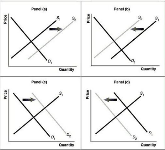 Alt text for Figure 3.13a: In figure 3.13a, a graph of intersecting demand and supply curves represents a rising supply of bicycle helmets.
Long description for Figure 3.13a: The x-axis is labelled, Quantity and the y-axis is labelled, as Price.Curve D1 is a straight line which slopes down from the top left corner to the bottom right corner.Curve S1 is a straight line which slopes up from the bottom left to the top right.The point of intersection is at the midpoints of both lines.Curve S2 is a straight line, parallel to curve S1, but plotted to the right.A right pointing arrow indicates the change from S1 to S2.
Alt text for Figure 3.13b: In figure 3.13b, a graph of intersecting demand and supply curves represents a falling supply of bicycle helmets.
Long description for Figure 3.13b: The x-axis is labelled, Quantity and the y-axis is labelled, as Price.Curve D1 is a straight line which slopes down from the top left corner to the bottom right corner.Curve S1 is a straight line which slopes up from the bottom left to the top right.The point of intersection is at the midpoints of both lines.Curve S2 is a straight line, parallel to curve S1, but plotted to the left.A left pointing arrow indicates the change from S1 to S2.
Alt text for Figure 3.13c: In figure 3.13c, a graph of intersecting demand and supply curves represents a rising demand for bicycle helmets.
Long description for Figure 3.13c: The x-axis is labelled, Quantity and the y-axis is labelled, as Price.Curve D1 is a straight line which slopes down from the top left corner to the bottom right corner.Curve S1 is a straight line which slopes up from the bottom left to the top right.The point of intersection is at the midpoints of both lines.Curve D2 is a straight line, parallel to curve D1, but plotted to the right.A right pointing arrow indicates the change from D1 to D2.
Alt text for Figure 3.13d: In figure 3.13d, a graph of intersecting demand and supply curves represents a falling demand for bicycle helmets.
Long description for Figure 3.13d: The x-axis is labelled, Quantity and the y-axis is labelled, as Price.Curve D1 is a straight line which slopes down from the top left corner to the bottom right corner.Curve S1 is a straight line which slopes up from the bottom left to the top right.The point of intersection is at the midpoints of both lines.Curve D2 is a straight line, parallel to curve D1, but plotted to the left.A left pointing arrow indicates the change from D1 to D2.
-Refer to Figure 3.13.Assume that the graphs in this figure represent the demand and supply curves for almonds.Which panel best describes what happens in this market when there is an increase in the productivity of almond harvesters?
Definitions:
Weighted-Average Cost Method
The weighted-average cost method is an inventory valuation approach that assigns a cost to inventory on the basis of the average cost of all similar items in the inventory.
Blending Department
A specialized section within a manufacturing facility where different materials or ingredients are mixed or combined to create a product.
Material Costs
Expenses associated with the materials required for the production of goods or services, usually categorized as direct materials that are part of the final product and indirect materials that support production.
Weighted-Average Method
An inventory costing approach where the cost of goods sold and ending inventory values are determined using the average cost of all inventory items, weighted by the quantity of each.
Q24: If a Canadian engineer works on contract
Q38: Crystal Schick is a highly talented photographer.She
Q51: Adam Smith's _ refers to the process
Q51: Refer to Figure 3.1.If the product represented
Q100: The circular flow of income shows that
Q103: Scott is a woodworker and charges $125
Q108: The price of lobster is typically lower
Q152: The Philippines and Vietnam have roughly the
Q260: If income is unequally distributed in an
Q273: To calculate GDP by the expenditure method,