Figure 3.6 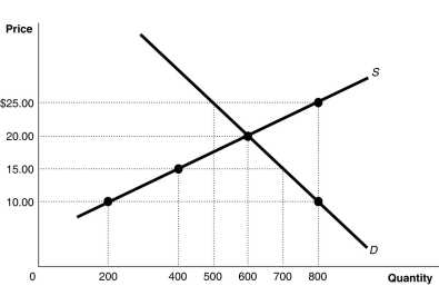 Alt text for Figure 3.6: In figure 3.6, a graph of intersecting supply and demand curves illustrates shortage and surplus in a market, along with its equilibrium.
Long description for Figure 3.6: The x-axis is labelled, Quantity, with the values 0, 200, 400, 500, 600, 700 and 800 marked.The y-axis is labelled, Price, with the values 0, 10.00, 15.00, 20.00 and 25.00 dollars marked.Curve Supply S is a straight line which slopes up from the bottom left corner to the top right corner.4 points are plotted along the curve; (200, 10) , (400, 15) , (600, 20) , and (800, 25) .Demand curve D is a straight line which slopes down from the top left corner to the bottom right corner.Curve D intersects the S curve at (600, 20) , and passes through another point, (800, 10) .All plotted points are connected to the corresponding values on the x and y-axis with dotted lines.
-Refer to Figure 3.6.At a price of $10, how many units will be sold?
Definitions:
Q52: Refer to Figure 2.2.The linear production possibilities
Q106: If an economy's exports rise by $8
Q111: Without technological advancement, how can a nation
Q156: The production possibilities frontier model shows that<br>A)if
Q186: Which of the following would cause a
Q226: Suppose that when the price of raspberries
Q227: The income effect explains why there is
Q232: Refer to Table 4.1.1. Based on the
Q235: If the number employed is 190 million,
Q251: Investment, as defined by economists, would not