Figure 7.2 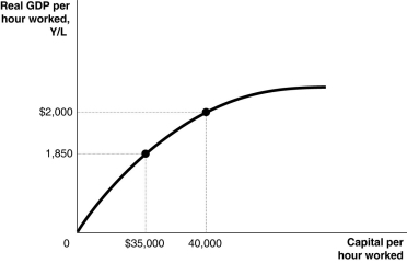 Alt text for Figure 7.2: In figure 7.2, a graph comparing capital per hour worked and real GDP per hour worked.
Long description for Figure 7.2: The x-axis is labelled, capital per hour worked.The y-axis is labelled, real GDP per hour worked, Y/L.A concave curve originates from 0 at the vertex and passes through 2 points ($35,000, 1,850) and (40,000, $2000) , toward the end of the x-axis.These 2 points are connected to their respective coordinates on the x-axis and y-axis with dotted lines.
-Refer to Figure 7.2.Assuming no technological change, if Canada increases capital per hour worked by $40,000 every year between 2015 and 2020, we would expect to see
Definitions:
Q7: If your nominal wage rises faster than
Q14: An efficiency wage<br>A)is higher than the market
Q57: The total amount of physical capital available
Q108: An economy can improve its standard of
Q132: Which of the following indicates that the
Q133: What are menu costs?<br>A)the full list of
Q147: Actual real GDP will be above potential
Q239: If disposable income increases by $500 million,
Q254: One drawback of the patent system is
Q263: If planned aggregate expenditure is greater than