Figure 9.1 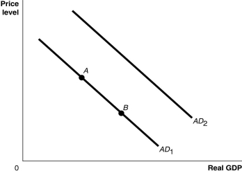 Alt text for Figure 9.1: In figure 9.1, a graph comparing real GDP and price level.
Long description for Figure 9.1: The x-axis is labelled, real GDP, and the y-axis is labelled, price level, with 0 at the vertex.Line AD1 begins in the top left corner and slopes down to the bottom center.Line AD2 follows the same slope as line AD1 but is plotted to the right.Points A and B are plotted along line AD1.Point A is a little less than half way along the left side of the line, and point B is little more than half way on the right side of the line.
-Refer to Figure 9.1.Ceteris paribus, an increase in interest rates would be represented by a movement from
Definitions:
Q4: A decrease in aggregate expenditure has what
Q5: If planned aggregate expenditure is above potential
Q14: Draw a graph of "catch-up" that shows
Q43: Would the maximum loan that a bank
Q83: Higher personal income taxes<br>A)increase aggregate demand.<br>B)increase disposable
Q114: Refer to Scenario 10.2.As a result of
Q212: If the Bank of Canada buys government
Q219: A decrease in the real interest rate
Q258: The multiplier is calculated as the<br>A)change in
Q267: An increase in taxes will _ consumption