Figure 9.1 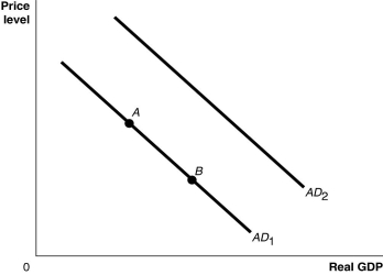 Alt text for Figure 9.1: In figure 9.1, a graph comparing real GDP and price level.
Long description for Figure 9.1: The x-axis is labelled, real GDP, and the y-axis is labelled, price level, with 0 at the vertex.Line AD1 begins in the top left corner and slopes down to the bottom center.Line AD2 follows the same slope as line AD1 but is plotted to the right.Points A and B are plotted along line AD1.Point A is a little less than half way along the left side of the line, and point B is little more than half way on the right side of the line.
-Refer to Figure 9.1.Ceteris paribus, an increase in personal income taxes would be represented by a movement from
Definitions:
Q11: Suppose a bank has $100 million in
Q21: Which of the following will reduce consumer
Q30: If the rate of inflation is expected
Q84: The productivity slowdown experienced in Canada from
Q115: Equilibrium GDP is equal to<br>A)autonomous expenditure times
Q119: The quantity equation becomes the basis for
Q120: At each of the three points in
Q210: If disposable income falls by $40 billion
Q218: The federal government lowered income taxes for
Q237: Explain how each of the following events