Figure 14.3 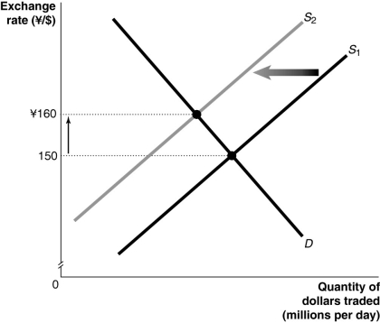 Alt text for Figure 14.3: In figure 14.3, a graph illustrates the quantity of dollars traded against the exchange rate.
Long description for Figure 14.3: The x-axis is labelled, quantity of dollars traded in millions per day, and the y-axis is labelled, exchange rate, Japanese yen against Canadian dollars, with the values 150 and 160 yen marked.2 straight line supply curves slope up from the bottom left corner to the top right corner.Supply curve D is a straight line which slopes down from the top left corner to the bottom right corner.Supply curves, S1 and S2, intersect curve D.The intersection point of S1 and D is connected to its corresponding y-axis value of 150 with a dotted line.The intersection point of S2 and D is connected to its corresponding y-axis value of 160 with a dotted line.An up pointing arrow indicates the difference between the 2 y-axis values.A left pointing arrow indicates the change from curve S1 to curve S2.
-Refer to Figure 14.3.Consider the market for Canadian dollars against the Japanese yen shown above.An event that could have caused the changes shown in the graph would be
Definitions:
Q5: Thailand's experience with pegging the baht to
Q14: The _ model is used to define
Q29: _ is the use of information technology
Q37: Assume a closed economy, that taxes are
Q106: The balance of payments includes which three
Q113: In 1991, Argentina decided to peg its
Q150: The case for austerity is different in
Q162: Increasing the federal budget deficit will contribute
Q199: If the balance on the current account
Q233: The short-run Phillips curve will not shift