Figure 14.1 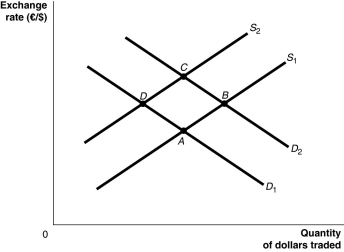 Alt text for Figure 14.1: In figure 14.1, a graph illustrates the quantity of dollars traded against the exchange rate.
Long description for Figure 14.1: The x-axis is labelled, quantity of dollars traded, and the y-axis is labelled, exchange rate, euros against dollars.2 supply curves; S1 and S2, and two demand curves; D1 and D2 are plotted.Supply curve S1 is a straight line which slopes up from the bottom left corner to the top left corner, and passes through points A and B.Supply curve S2 is a straight line with the same slope as S1, but plotted above.S2 passes through points D and C.Demand curve D1 is a straight line, which slopes down from the top left corner to the bottom right corner.Curve D1 intersects curve S1 at point A, and curve S2 at point D.Demand curve D2 is a straight line with the same slope as D1, but plotted above.Curve D2 intersects curve S1 at point B, and curve S2 at point C.
-Refer to Figure 14.1.Suppose that Canadian government deficits cause interest rates in Canada to rise relative to those in the European Union.Assuming all else remains constant, how would this be represented?
Definitions:
Q24: If two countries adhere to a gold
Q43: If the Bank of Canada chooses to
Q111: What is the difference between net exports
Q111: If one U.S.dollar could be exchanged for
Q113: In 1991, Argentina decided to peg its
Q195: If Ontarians increase their purchases of Italian
Q208: The long-run Phillips curve is _ than
Q216: Following a decrease in government spending, as
Q224: Expansionary monetary policy will have what effect
Q250: According to economists Robert Lucas and Thomas