Figure 15.5 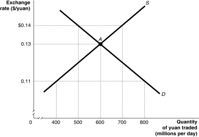 Alt text for Figure 15.5: In figure 15.5, a graph illustrates the quantity of yuan traded against the exchange rate.
Long description for Figure 15.5: The x-axis is labelled, quantity of yuan traded in millions per day.The y-axis is labelled, exchange rate, Canadian dollar against the yuan.Supply curve S, is a straight line which slopes up from the bottom left corner to the top right corner.Demand curve D, is a straight line which slopes down from the top left corner to the bottom right corner.The curves intersect at point A, (600, 0.13) .Point A, and unmarked points (800, 0.11) , (500, $0.14) , (700, $0.14) , and (400, 0.11) are all connected to their corresponding values on the x and y-axes with dotted lines.
-Refer to Figure 15.5.Suppose the pegged exchange rate is $0.11/yuan.Because of safety concerns and numerous product recalls, U.S.consumers lower their demand for Chinese products.Using the figure above, this would
Definitions:
Swiss Chalet Franchise
A business opportunity that involves becoming a part of the Swiss Chalet chain of restaurants, known for their rotisserie chicken.
Total Interest
The cumulative amount of interest paid or earned over the life of a loan or investment.
Invested
The exercise of designating funds with the anticipation of achieving financial gains or income.
Cinnamon Buns
Sweet baked goods made from dough containing cinnamon and sugar, often glazed or frosted.
Q4: The gold standard is an example of<br>A)a
Q13: Describe the four quality-related costs and tell
Q32: How is the impact of expansionary monetary
Q90: In the late 1990s, as foreign investors
Q90: If a country has a fixed exchange
Q126: China began pegging its currency, the yuan,
Q164: Over the past two decades, whenever changes
Q200: Before 1980, most Canadian corporations raised funds<br>A)in
Q218: In 1991, Argentina decided to peg its
Q278: If the Bank of Canada does not