Figure 15.9 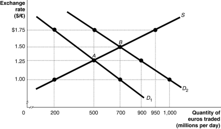 Alt text for Figure 15.9: In figure 15.9, a graph illustrates the quantity of euros traded against the exchange rate.
Long description for Figure 15.9: The x-axis is labelled, quantity of euros traded in millions per day.The y-axis is labelled, exchange rate, Canadian dollar against the euro.A straight line supply curve, S, slopes up from the bottom left corner to the top right corner.2 straight line demand curves, D1 and D2, slope down from the top left corner to the bottom right corner.Curve D2 is plotted to the right of curve D1.The difference between the curves is indicated by a right pointing arrow.Curve S intersects curves D1 and D2 at points A (500, 1.25) and B (700, 1.50) .Point (200, 1.00) is plotted near the bottom of curve S.Point (950, 1.75) is plotted near the top of curve S.Point (500, 1.75) is plotted near the top of curve D2.Points (900, 1.25) and point (1,000, 1.00) are plotted near the bottom of curve D2.Point (200,1.75) is plotted near the top of curve D1.Point (700, 1.00) is plotted near the bottom of curve D1.All points are connected to their corresponding values on the x and y-axes with dotted lines.
-Refer to Figure 15.9.The equilibrium exchange rate is originally at A, $1.25/euro.Suppose the European Central Bank pegs its currency at $1.00/euro.Speculators expect that the value of the euro will rise, and this shifts the demand curve for euros to D2.If the European Central Bank abandons the peg, the equilibrium exchange rate would be
Definitions:
Q1: A country which incurs a current account
Q4: An increase in capital inflows will<br>A)increase net
Q9: A customer enters a business and has
Q19: Which job title would be given to
Q131: Refer to Figure 15.10.The Chinese government pegs
Q141: If one Canadian dollar could be exchanged
Q153: In order to maintain an undervalued yuan
Q179: Why do countries peg their currencies, and
Q218: An appreciating yen makes Japanese products<br>A)more expensive
Q245: When net capital flows are positive,<br>A)capital inflows