Figure 3.13 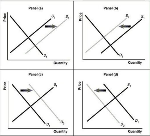 Alt text for Figure 3.13a: In figure 3.13a, a graph of intersecting demand and supply curves represents a rising supply of bicycle helmets.
Long description for Figure 3.13a: The x-axis is labelled, Quantity and the y-axis is labelled, as Price.Curve D1 is a straight line which slopes down from the top left corner to the bottom right corner.Curve S1 is a straight line which slopes up from the bottom left to the top right.The point of intersection is at the midpoints of both lines.Curve S2 is a straight line, parallel to curve S1, but plotted to the right.A right pointing arrow indicates the change from S1 to S2.
Alt text for Figure 3.13b: In figure 3.13b, a graph of intersecting demand and supply curves represents a falling supply of bicycle helmets.
Long description for Figure 3.13b: The x-axis is labelled, Quantity and the y-axis is labelled, as Price.Curve D1 is a straight line which slopes down from the top left corner to the bottom right corner.Curve S1 is a straight line which slopes up from the bottom left to the top right.The point of intersection is at the midpoints of both lines.Curve S2 is a straight line, parallel to curve S1, but plotted to the left.A left pointing arrow indicates the change from S1 to S2.
Alt text for Figure 3.13c: In figure 3.13c, a graph of intersecting demand and supply curves represents a rising demand for bicycle helmets.
Long description for Figure 3.13c: The x-axis is labelled, Quantity and the y-axis is labelled, as Price.Curve D1 is a straight line which slopes down from the top left corner to the bottom right corner.Curve S1 is a straight line which slopes up from the bottom left to the top right.The point of intersection is at the midpoints of both lines.Curve D2 is a straight line, parallel to curve D1, but plotted to the right.A right pointing arrow indicates the change from D1 to D2.
Alt text for Figure 3.13d: In figure 3.13d, a graph of intersecting demand and supply curves represents a falling demand for bicycle helmets.
Long description for Figure 3.13d: The x-axis is labelled, Quantity and the y-axis is labelled, as Price.Curve D1 is a straight line which slopes down from the top left corner to the bottom right corner.Curve S1 is a straight line which slopes up from the bottom left to the top right.The point of intersection is at the midpoints of both lines.Curve D2 is a straight line, parallel to curve D1, but plotted to the left.A left pointing arrow indicates the change from D1 to D2.
-Refer to Figure 3.13.Assume that the graphs in this figure represent the demand and supply curves for rice.What happens in this market if buyers expect the price of rice to fall?
Definitions:
Unemployed Resources
Factors of production that are available for use but are not currently engaged in the production of goods or services.
Keynesian Model
An economic theory stating that government intervention through fiscal policies is necessary to moderate the boom and bust cycles of an economy.
Horizontal Range
In the context of data visualization or statistical analysis, it refers to the span or extent of values along the horizontal axis, typically representing time or categories.
AS Curve
The Aggregate Supply curve, depicting the total amount of goods and services that producers in an economy are willing to sell at different price levels.
Q21: In economies with no effective government<br>A)standards of
Q24: Refer to Table 4.21.Given the information above,calculate
Q38: If,in response to a decrease in the
Q104: Refer to Figure 2.14.Which country has a
Q166: Refer to Figure 2.13.What is the opportunity
Q166: Even when the demand for one good
Q224: Which of the following explains the changes
Q229: Refer to Figure 3.14.The graph in this
Q247: Refer to Table 4.9.Suppose that the above
Q292: Refer to Table 3.5.The equations above describe