Figure 7.2 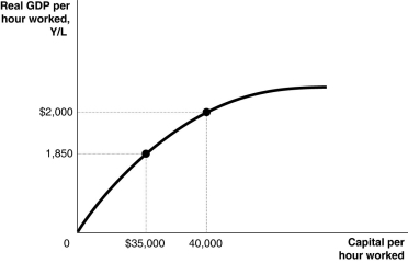 Alt text for Figure 7.2: In figure 7.2, a graph comparing capital per hour worked and real GDP per hour worked.
Long description for Figure 7.2: The x-axis is labelled, capital per hour worked.The y-axis is labelled, real GDP per hour worked, Y/L.A concave curve originates from 0 at the vertex and passes through 2 points ($35,000, 1,850) and (40,000, $2000) , toward the end of the x-axis.These 2 points are connected to their respective coordinates on the x-axis and y-axis with dotted lines.
-Refer to Figure 7.2.Assuming no technological change, if Canada increases capital per hour worked by $40,000 every year between 2015 and 2020, we would expect to see
Definitions:
Arrival Rate
In queueing theory, the average rate at which entities arrive into a system or process, typically measured per unit time.
Service Rate
The speed at which a service provider or system can complete a task or service for its customers or processes.
Arrival Rate
In queueing theory, it refers to the average rate at which entities arrive and require service, often measured per time unit.
FCFS
First-Come, First-Served, a principle where the requests are processed in the order they were received, commonly used in service areas and scheduling.
Q3: Shelter is the largest component of the
Q38: Consumption is $5 billion,planned investment spending is
Q67: If the marginal propensity to save is
Q106: There is a federal budget deficit when<br>A)the
Q109: When prices are rising,which of the following
Q137: When Javier's income increases by $5,000,he spends
Q145: Suppose you lend $1,000 at an interest
Q175: When a recession ends,<br>A)interest rates decrease.<br>B)households decrease
Q195: Relative to productivity growth in the United
Q259: _ depend on increases in labour productivity.<br>A)Advances