Figure 15.9 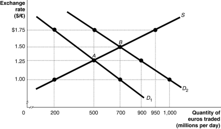 Alt text for Figure 15.9: In figure 15.9, a graph illustrates the quantity of euros traded against the exchange rate.
Long description for Figure 15.9: The x-axis is labelled, quantity of euros traded in millions per day.The y-axis is labelled, exchange rate, Canadian dollar against the euro.A straight line supply curve, S, slopes up from the bottom left corner to the top right corner.2 straight line demand curves, D1 and D2, slope down from the top left corner to the bottom right corner.Curve D2 is plotted to the right of curve D1.The difference between the curves is indicated by a right pointing arrow.Curve S intersects curves D1 and D2 at points A (500, 1.25) and B (700, 1.50) .Point (200, 1.00) is plotted near the bottom of curve S.Point (950, 1.75) is plotted near the top of curve S.Point (500, 1.75) is plotted near the top of curve D2.Points (900, 1.25) and point (1,000, 1.00) are plotted near the bottom of curve D2.Point (200,1.75) is plotted near the top of curve D1.Point (700, 1.00) is plotted near the bottom of curve D1.All points are connected to their corresponding values on the x and y-axes with dotted lines.
-Refer to Figure 15.9.The equilibrium exchange rate is originally at A, $1.25/euro.Suppose the European Central Bank pegs its currency at $1.00/euro.Speculators expect that the value of the euro will rise, and this shifts the demand curve for euros to D2.If the European Central Bank abandons the peg, the equilibrium exchange rate would be
Definitions:
Penlight
A small, lightweight flashlight used in medical examinations to check patients' pupil response or throat.
Mechanoreceptors
Sensory receptors in the body that respond to mechanical pressures or distortions, such as touch, pressure, stretch, and vibration.
Chemoreceptors
Sensory receptors that respond to chemical stimuli, found in various locations in the body and involved in processes like taste, smell, and respiratory control.
Dementia
A chronic or progressive syndrome marked by the deterioration of cognitive function, affecting memory, thinking, orientation, comprehension, calculation, learning capacity, language, and judgment.
Q13: The famous observation that households and firms
Q32: When a single person (or small group)has
Q66: The fact that different countries experience different
Q66: Why does continued foreign investment in U.S.stocks
Q90: If the rent for apartments in New
Q99: Net foreign investment is equal to<br>A)capital inflows
Q180: An appreciating yen makes Japanese products<br>A)more expensive
Q203: Government policies designed to equalize the distribution
Q333: After much consideration,you have chosen Cancun over
Q341: The circular-flow diagram<br>A) is an economic model.<br>B)