The histograms show the cost of living,in dollars,for 32 Canadian cities.The histogram on the left shows the cost of living for the 32 cities using bins $10 wide,and the histogram on the right displays the same data using bins that are $6 wide. 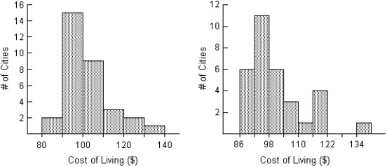
Compare the distributions (shape,centre,spread,unusual features) .
Definitions:
Domestic Demand Curves
Graphs showing the quantity of a good that consumers in a domestic market are willing and able to purchase at various prices.
Import Demand Curves
Charts representing the volumes of a product that an economy is ready to import at various price points.
Export Supply Curves
A graphical representation showing the relationship between the quantity of a good that producers are willing to export and the price of the good in the international market.
Equilibrium World Price
The price at which the quantity of a good supplied globally equals the quantity demanded, in international trade.
Q2: On January 1, 2011, P Company purchased
Q12: Mr.Smith works at a computer consultant company
Q20: Here is the stem-and-leaf display of the
Q21: Suppose that there are two candidates for
Q38: A purchased company must be recorded at
Q41: Shown below are the boxplot,the histogram and
Q41: An investor expects to receive 10 payments
Q51: A survey of automobiles parked in student
Q57: The number of cars passing through a
Q136: On January 1, 2013, a company's balance