Figure 18-8 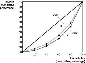
-Refer to Figure 18-8 to answer the following questions.
a. Did the distribution of income become more equal in 2012 than it was in 2011, or did it become less equal? Explain.
b. If area A = 1,900, area B = 450, and area C = 2,650, calculate the Gini coefficient for 2011 and the Gini coefficient for 2012.
Definitions:
Supply Curve
Graph that shows the relationship between different prices and the quantities that sellers will offer for sale, regardless of demand.
Technologies
The application of scientific knowledge for practical purposes, especially in industry and improvements in tools, machinery, and devices.
Suppliers
Entities that provide goods or services to another entity, typically within a supply chain context.
Quantity Demanded
The total amount of a good or service that consumers are willing and able to purchase at a specific price level at a given period.
Q9: To calculate GDP using the value-added method,
Q10: The demand for labor is different from
Q17: Explain the effect of price elasticities of
Q28: Refer to the Article Summary. The pricing
Q105: Refer to Figure 18-2. If the government
Q111: Refer to Figure 16-4. Graph (a) represents
Q156: The U.S. work week has declined from
Q202: If demand is taken into account, firms
Q213: The following table contains the actual prices
Q254: From an economic perspective, price discrimination is