Figure 35-3.The left-hand graph shows a short-run aggregate-supply (SRAS) curve and two aggregate-demand (AD) curves.On the left-hand diagram,Y represents output and on the right-hand diagram,U represents the unemployment rate. 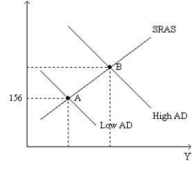
-Refer to Figure 35-3.Assume the figure depicts possible outcomes for the year 2018.In 2018,the economy is at point A on the left-hand graph,which corresponds to point A on the right-hand graph.The price level in the year 2017 was
Definitions:
Units of Product
The quantity of product items or goods produced.
Actual Hours Worked
This refers to the total hours an employee has been physically present and working at their job within a specific period.
Direct Labor Costs
The wages and benefits paid to employees who are directly involved in the production of goods or services.
Variable Overhead Efficiency Variance
The difference between the actual variable overhead and the standard cost of variable overhead allocated for the actual production.
Q1: If the MPC is 0.8 and there
Q8: The Employment Act of 1946<br>A)implies that the
Q25: Suppose households attempt to decrease their money
Q28: The principal reason that monetary policy has
Q42: The multiplier effect is exemplified by the
Q59: A 2009 article in The Economist noted
Q90: Refer to Scenario 34-2.In response to which
Q105: If the marginal propensity to consume is
Q134: Other things the same,which of the following
Q159: In the nineteenth century,some countries were on