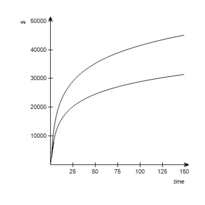
The following figure shows a graph that compares the present values of two ordinary annuities of $800 quarterly as functions of the number of quarters. One annuity is at an annual rate of 6% compounded quarterly, and the other is at an annual rate of 9% compounded quarterly. Use the graph below to estimate the difference between the present values of these annuities for 25 years (100 quarters) .
Definitions:
Q26: Suppose Becky has her choice of $20,000
Q37: The tables below give the numbers of
Q59: A card is drawn from an ordinary
Q76: Suppose that Tom Martin deposits his $11,500
Q80: Reaction time for a group of people
Q95: Suppose that an employer plans to hire
Q114: Write the transpose of matrix F.
Q128: Time-share sales provide an opportunity for vacationers
Q137: The following table gives the numbers of
Q193: Use matrix A to find A<sup>3</sup>, if