The figure below shows the demand and supply curves in the market for elementary education. Figure 13.1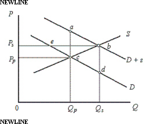 In the figure,
D: Private demand curve for elementary education
D + s: Demand curve which includes public benefits
S: Supply curve of education
Price and Quantity have been taken on vertical and horizontal axes respectively.
In Figure 13.1, D represents the private demand for education, and D+s represents the demand including the public benefits of education.According to the figure, the optimal subsidy is equal to:
Definitions:
Q3: If a market is narrowly defined, the
Q24: After the year 2000, the FOMC changed
Q30: The reduction in the U.S.government deficit in
Q41: Assume that the reserve requirement is 10
Q54: Which of the following is a characteristic
Q89: _ refers to the changes in government
Q92: The Gramm-Leach-Bliley Act (GLBA), passed by the
Q92: In long-run equilibrium, each monopolistically competitive firm
Q103: The primary international reserves in most countries
Q112: When the Fed uses money growth rates