Figure 7.1 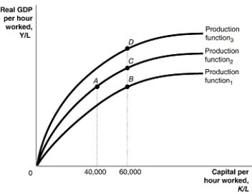 Alt text for Figure 7.1: In figure 7.1, a graph comparing capital per hour worked and real GDP per hour worked.
Long description for Figure 7.1: The x-axis is labelled, capital per hour worked, K/L, with values 40,000 and 60,000 marked.The y-axis is labelled, real GDP per hour worked, Y/L, with 0 at the vertex.3 concave curves, each originating from the vertex are shown.4 points A, B, C, and D are plotted such that point A has 40,000 as the x coordinate, and points B, C, and D have 60,000 as the x coordinate.The 3 curves pass through these points.The curve labelled, Production function 1, passes through point B.The curve labelled, Production function 2, passes through points A and C.The curve labelled, Production function 3, passes through point D.
-Refer to Figure 7.1.Suppose the per-worker production function in the figure above represents the production function for the Canadian economy.If Canada decided to double its support of university research, this would cause a movement from
Definitions:
Exported
Items or services exported from one country to another for commercial purposes.
Demand
The desire to purchase goods and services backed by the ability and willingness to pay a price.
Euros
The official currency of the eurozone, which is used by 19 of the 27 European Union countries.
Downsloping
Describes a line or curve on a graph that proceeds from upper left to lower right, often used in economics to represent the decrease in demand as prices increase.
Q16: The nominal interest rate minus the inflation
Q41: In September 2016, the government of Alberta
Q41: The purchase of stocks and bonds issued
Q62: If the per-worker production function shifts up,<br>A)it
Q84: The productivity slowdown experienced in Canada from
Q133: What are menu costs?<br>A)the full list of
Q239: If disposable income increases by $500 million,
Q258: The per-worker production function shows the relationship
Q268: Actual investment spending does not include<br>A)spending on
Q277: Investment spending _ during a recession, and