Figure 7.3 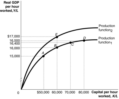 Alt text for Figure 7.3: In figure 7.3, a graph, comparing capital per hour worked and real GDP per hour worked.
Long description for Figure 7.3: The x-axis is labelled, capital per hour worked, K/L.The y-axis is labelled, real GDP per hour worked, Y/L.2 concave curves originating from 0 at the vertex are shown.5 points A ($50000, $15000) , B ($60000, $16000) , C ($70000, $16400) , D ($80000, $16500) , and E ($60000, $17000) are plotted.The curve labelled Production function 1, passes through points A, B, C, and D.The curve labelled Production function 2, passes through point E.These 5 points are connected to their respective coordinates on the x and y-axis with dotted lines.
-Refer to Figure 7.3. Many workers leaving a region is shown in the figure above by a movement from
Definitions:
Northern Québec
A geographical region in Canada, characterized by its vast, sparsely populated territories and predominance of Indigenous cultures.
Sydney Steel Company
Was a steel production company located in Sydney, Nova Scotia, known for its historical significance in the region's industrial development.
Toxic Waste
Hazardous material that can cause injury or death to living organisms, often produced by industrial activity.
Nova Scotia
A province located on Canada's southeastern coast, known for its maritime heritage and natural beauty.
Q17: The lengths of the recession and expansion
Q39: Inflation that is _ than what is
Q50: What is the name of the organization
Q66: Refer to Table 7.7.Consider the statistics in
Q98: Refer to Figure 7.3. A large group
Q162: Refer to Table 8.14.Using the table above,
Q174: Lower interest rates increase both consumption and
Q222: High-income countries have _ and _ as
Q250: If the growth rate of real GDP
Q252: Which of the following will increase the