Figure 15.10 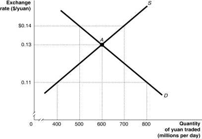 Alt text for Figure 15.10: In figure 15.10, a graph illustrates the quantity of yuan traded against the exchange rate.
Long description for Figure 15.10: The x-axis is labelled, quantity of yuan traded in millions per day.The y-axis is labelled, exchange rate, Canadian dollar against the yuan.Supply curve S, is a straight line which slopes up from the bottom left corner to the top right corner.Demand curve D, is a straight line which slopes down from the top left corner to the bottom right corner.The curves intersect at point A, (600, 0.13) .Point A, and unmarked points (800, 0.11) , (500, $0.14) , (700, $0.14) , and (400, 0.11) are all connected to their corresponding values on the x and y-axes with dotted lines.
-Refer to Figure 15.10.Suppose the Chinese government decides to abandon pegging the yuan to the Canadian dollar at a rate that overvalues the yuan.Using the figure above, the equilibrium exchange rate would be ________, and Chinese exports to Canada would ________ in price.
Definitions:
Total Area
The sum of all areas covered by a given shape or surface.
Normally Distributed
Describes a distribution that is symmetric around the mean, bell-shaped, and characterized by its mean and standard deviation.
Mean
The average value of a set of numbers, computed by dividing the sum of these numbers by the count of numbers in the set.
Median
The middle value in a list of numbers, which separates the higher half from the lower half of the dataset.
Q12: The balance of payments includes all of
Q25: Which of the following is "crowded out"
Q39: Refer to Figure 15.5.The Chinese government pegs
Q44: Which of the following approaches to process
Q49: Most of the participants in a supply
Q57: A cell phone manufacturer inspects the video
Q121: By 2015, how many European countries were
Q124: Before 1980, Canadian investors rarely invested in
Q135: If the Canadian dollar depreciates against the
Q189: In Canada today, how much gold will