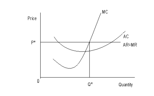
The following figure shows the cost and revenue structures of a firm. MC represents the marginal cost curve, AC represents the average cost curve, AR represents the average revenue curve, and MR represents the marginal revenue curve. P* is the equilibrium price and Q* is the equilibrium output.Figure 9.5
-Suppose Mark invests a sum of $100,000 in a new venture. To fund his investment, Mark withdraws $50,000 from a savings account paying 10% per year and uses the proceeds from a bond that has just matured worth $50,000. If he had reinvested the proceeds from the bond, he could have earned interest at the rate of 5%. Calculate the opportunity cost of capital for Mark in a particular year.
Definitions:
Demand Curve
A graph representing the relationship between the quantity of a good that consumers are willing and able to purchase and its price.
Supply Curve
A graphical representation showing the relationship between the price of a good and the quantity of that good that suppliers are willing to produce and sell.
Nike
A global corporation specializing in the design, development, and worldwide marketing of footwear, apparel, equipment, and accessory products.
Adidas
A global sports footwear and apparel manufacturer known for its innovation and association with athletics and leisure wear.
Q3: The figure given below depicts the demand
Q4: One danger associated with calls for fairness
Q32: The figure given below shows the revenue
Q42: The following figure shows revenue and cost
Q49: Why is there a supply point and
Q71: Suppose the 12-month interest rate on a
Q74: Some competitive firms are willing to operate
Q106: Why is each firm in a monopolistically
Q123: If losses are incurred in a competitive
Q126: The annual membership fees of the 185