Figure 3.15 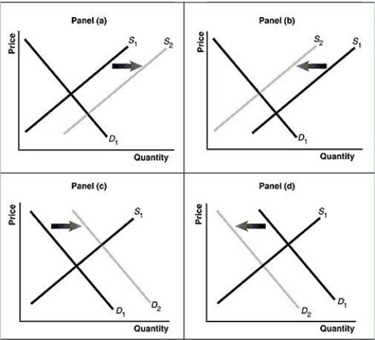 Alt text for Figure 3.15a: In figure 3.15a, a graph of intersecting demand and supply curves represents a rising supply of Blu-ray disc players.
Long description for Figure 3.15a: The x-axis is labelled, Quantity and the y-axis is labelled, as Price.Curve D1 is a straight line which slopes down from the top left corner to the bottom right corner.Curve S1 is a straight line which slopes up from the bottom left to the top right.The point of intersection is at the midpoints of both lines.Curve S2 is a straight line, parallel to curve S1, but plotted to the right.A right pointing arrow indicates the change from S1 to S2.
Alt text for Figure 3.15b: In figure 3.15b, a graph of intersecting demand and supply curves represents a falling supply of Blu-ray players.
Long description for Figure 3.15b: The x-axis is labelled, Quantity and the y-axis is labelled, as Price.Curve D1 is a straight line which slopes down from the top left corner to the bottom right corner.Curve S1 is a straight line which slopes up from the bottom left to the top right.The point of intersection is at the midpoints of both lines.Curve S2 is a straight line, parallel to curve S1, but plotted to the left.A left pointing arrow indicates the change from S1 to S2.
Alt text for Figure 3.15c: In figure 3.15c, a graph of intersecting demand and supply curves represents a rising demand for Blu-ray players.
Long description for Figure 3.15c: The x-axis is labelled, Quantity and the y-axis is labelled, as Price.Curve D1 is a straight line which slopes down from the top left corner to the bottom right corner.Curve S1 is a straight line which slopes up from the bottom left to the top right.The point of intersection is at the midpoints of both lines.Curve D2 is a straight line, parallel to curve D1, but plotted to the right.A right pointing arrow indicates the change from D1 to D2.
Alt text for Figure 3.15d: In figure 3.15d, a graph of intersecting demand and supply curves represents a falling demand for Blu-ray disc players.
Long description for Figure 3.15d: The x-axis is labelled, Quantity and the y-axis is labelled, as Price.Curve D1 is a straight line which slopes down from the top left corner to the bottom right corner.Curve S1 is a straight line which slopes up from the bottom left to the top right.The point of intersection is at the midpoints of both lines.Curve D2 is a straight line, parallel to curve D1, but plotted to the left.A left pointing arrow indicates the change from D1 to D2.
-Refer to Figure 3.15.Assume that the graphs in this figure represent the demand and supply curves for tuna.Which panel best describes what happens in this market when there is a decrease in the productivity of commercial fishermen?
Definitions:
Intracellular
Situated or happening inside a cell or cells.
Intravenous Catheter
A tube inserted into a vein to deliver fluids, medication, or nutrients directly into the bloodstream.
Phlebitis
Inflammation of a vein, often accompanied by pain and swelling, sometimes due to an infection or from the presence of an intravenous (IV) catheter.
Edematous
Describes tissue that is swollen due to the accumulation of excess fluid in the body's tissues.
Q68: Describe briefly how the final value of
Q120: Refer to Figure 3.15.Assume that the graphs
Q120: Refer to Table 4.13.Nominal GDP for Vicuna
Q157: Refer to Table 4.21.Given the information above,
Q192: In the circular flow diagram, _ supply
Q209: Which of the following would increase GNI
Q213: Even when the demand for one good
Q215: Refer to Figure 3.12.The figure above represents
Q233: Refer to Table 4.1.Suppose that a simple
Q239: Which of the following could cause nominal